![]()
This part is interesting because it allows you to monitor the development and the maturation of a specific trend.
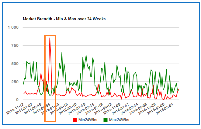
Imagine equity market is in a well established downtrend. In this case, there will be much more 24 weeks new lows than 24weeks new highs and the amount of 24 weeks new highs will be very limited.
We can notice on the chart below this is exactly what happened during 2011's summer:
Then, when the market resumes its uptrend, the amount of 24weeks new lows declines and the amount of 24 weeks new highs rises again.
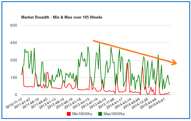
At the end of the uptrend, we can notice the amount of new highs on long term horizon (105 weeks) starts to decline on a regular basis:
At the same time, the amount of new 12 weeks (and 24 weeks) lows starts to rise:
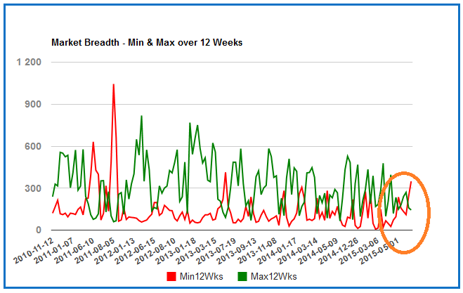
At this time, there is no drama but we must carefully monitor the situation because we will consider the uptrend is in high danger (and potentially over) when the amount of new 24 weeks lows is well above the amount of new 24 weeks high.
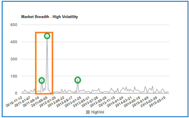
It is also very interesting to monitor the amount of stocks with abnormal volatitility because when we notice a huge spike on this chart, we can consider we are probably in a panic/capitulation move and we are probably (very) close to a short term bottom.
This indicator has been highly accurate in 2011 and 2013.